Visual Identity
Building DesignOGC’s Visual Identity System
Established a strategic visual framework covering logo, color, type, and brand expressions - designed to grow with the organization.
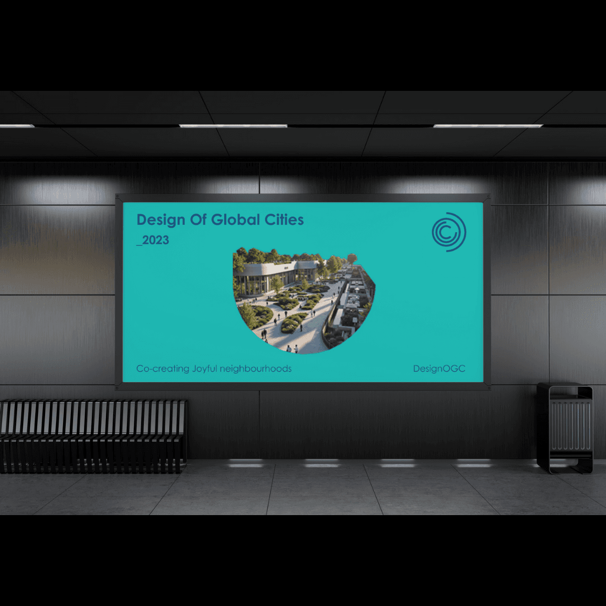
Verticle
Team
Role
Client
DesignOGC wasn’t just a branding project — it was the creation of a mission-driven visual identity rooted in the belief that joyful, inclusive neighborhoods are the foundation of a better world. As lead designer, I translated this vision into a scalable system that speaks across urban and rural contexts, inviting collaboration and shared ownership.
The goal: build a brand that’s emotionally resonant yet grounded in purpose — one that reflects our values of co-creation, equity, and transformation at the neighborhood scale.
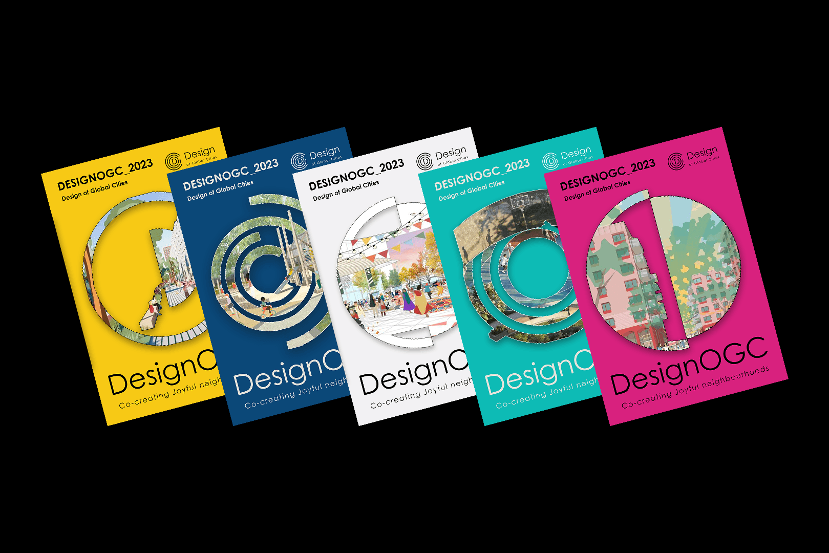
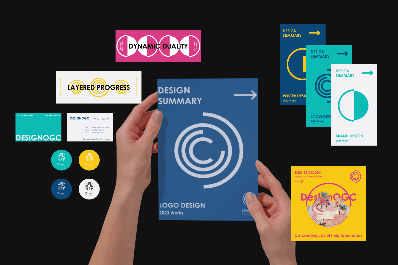
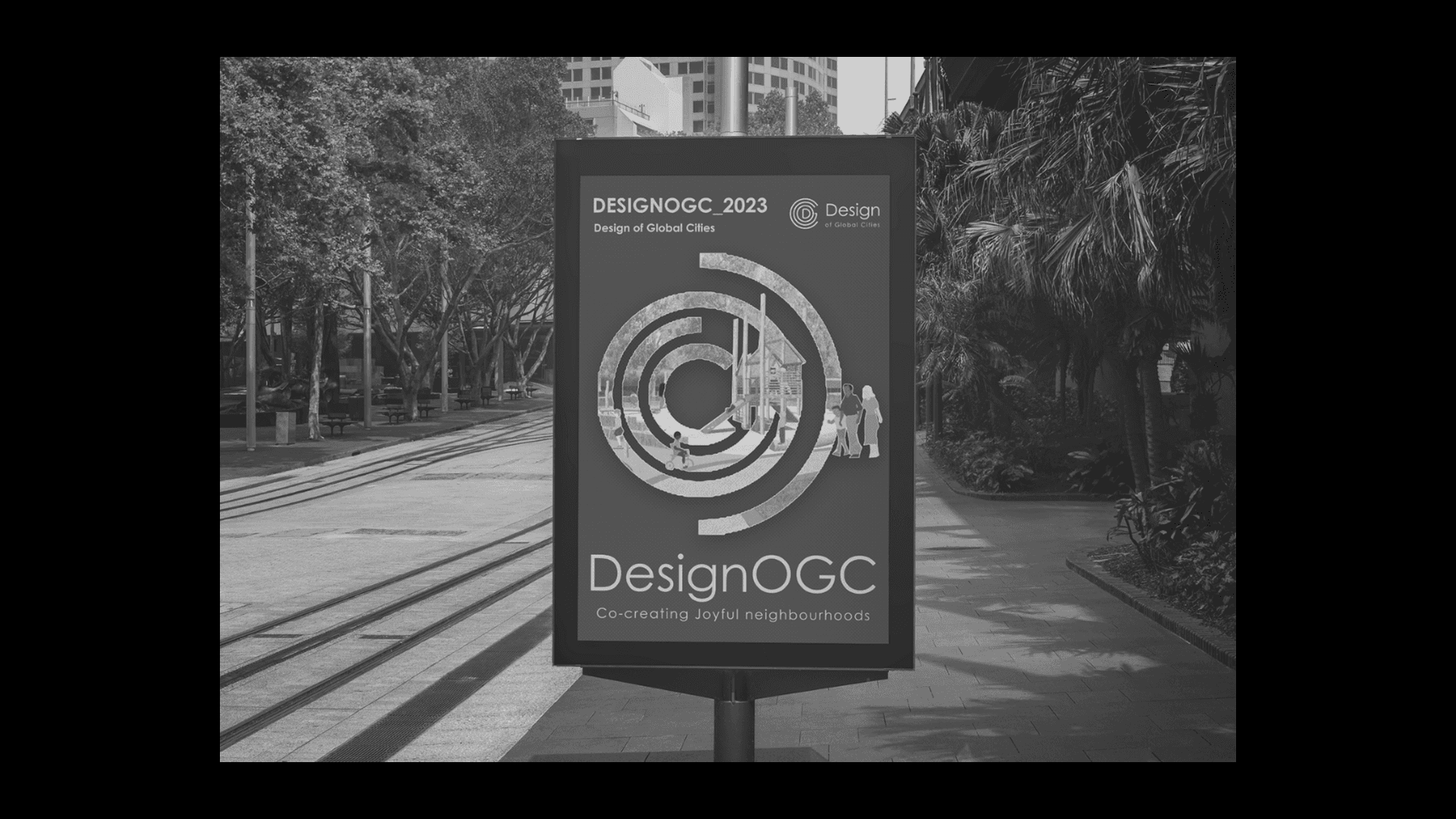
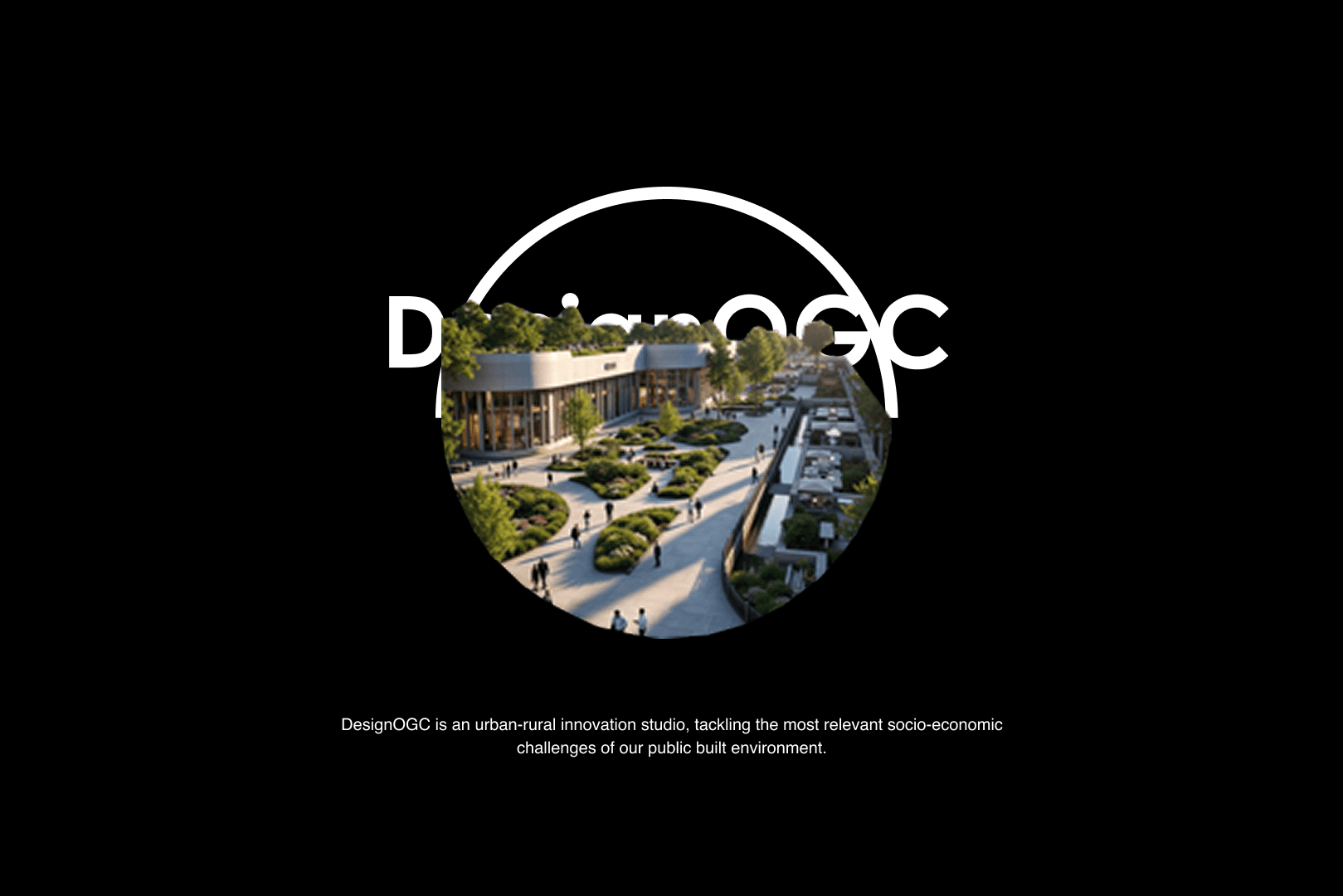
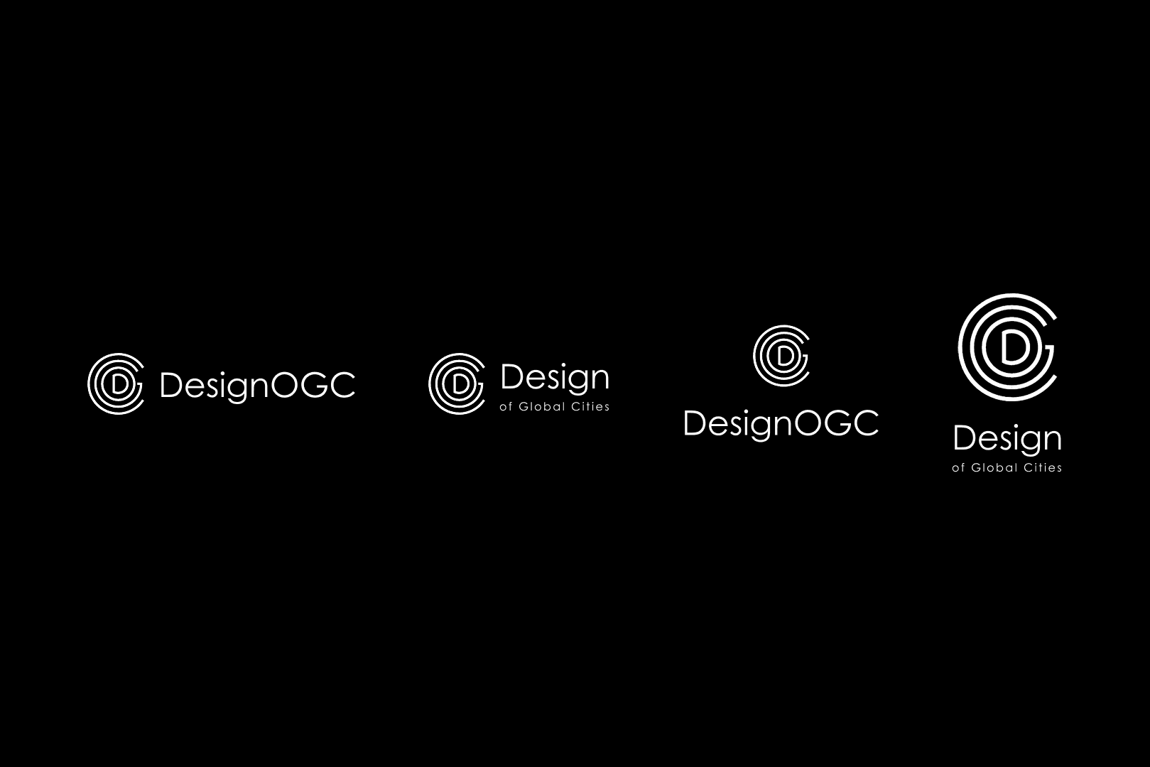
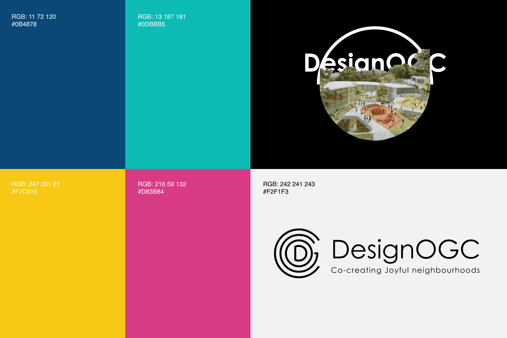
The logo merges form and meaning — with the inner “D” for Design and three outer curves representing “OGC.” Deliberate negative space signals openness, reflecting our collaborative DNA. The color palette was chosen with intention:
Dark Blue for trust and integrity
Robin’s Egg Blue for creativity and empathy
Grey for neutrality and deep listening
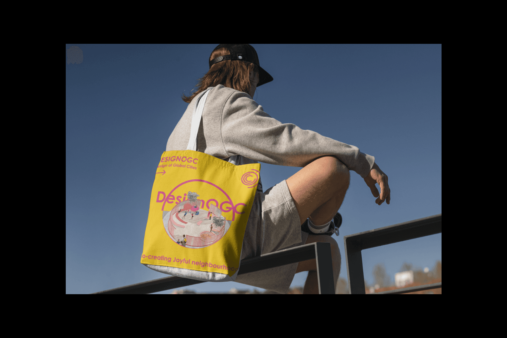
Ripe Lemon Yellow for vitality and hope
Cerise for bold impact
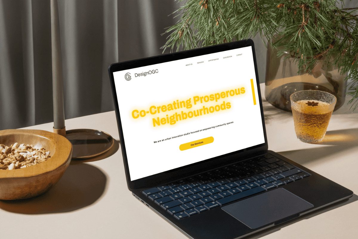
Century Gothic, with softened edges and a dark grey hue, brings modernity and approachability while reinforcing dependability.
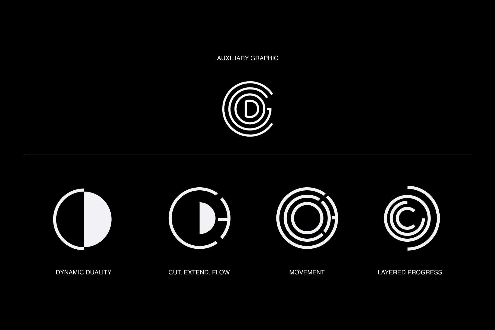
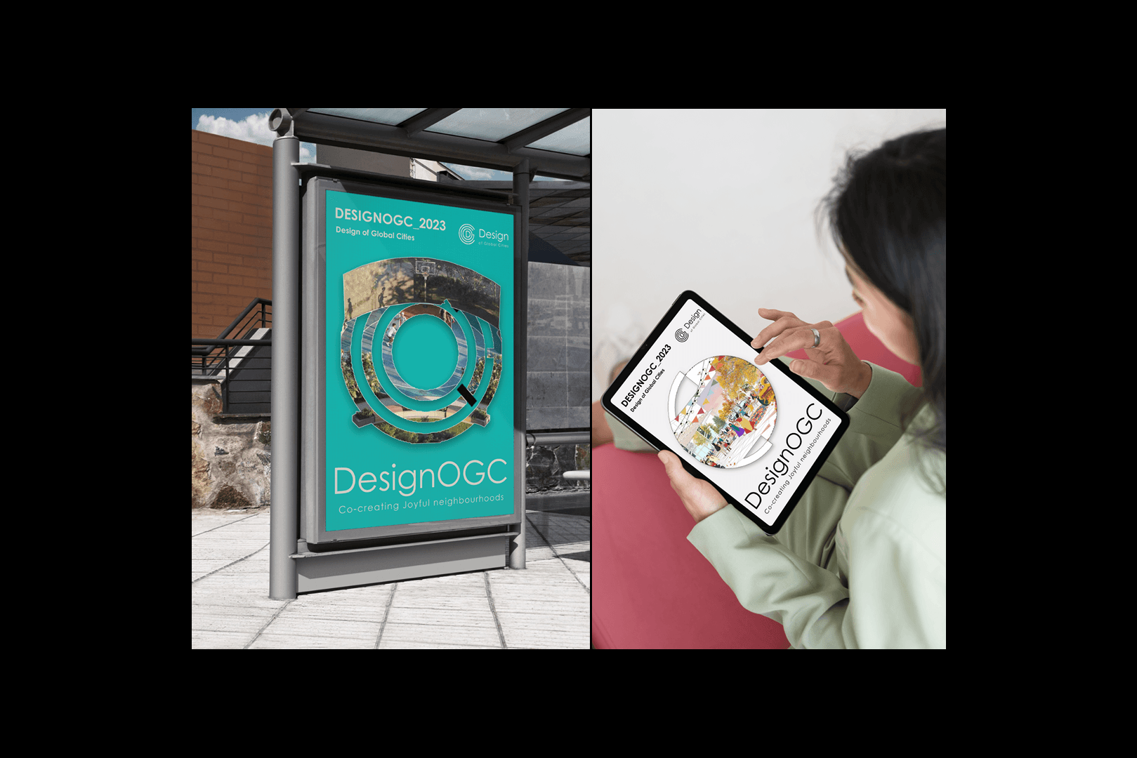
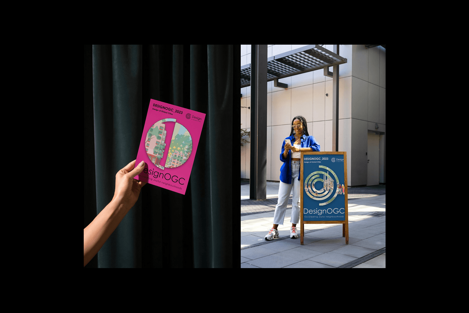
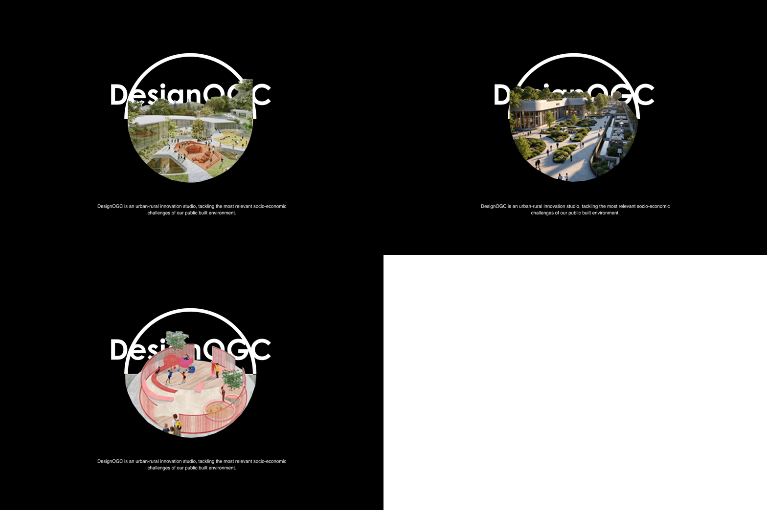
To extend the identity, I developed a flexible visual language using modular shapes from the logo — applied across icons, images, and mixed-media layouts to tell stories that scale. Every element was designed to feel alive, inclusive, and deeply aligned with our purpose.
This identity is more than a visual — it’s a signal of who we are and the kind of future we’re building.