Website Redesign
DesignOGC Website Redesign: Centering Community & Clarity
Redesigned DesignOGC’s website to reflect its mission and build a warm, community-first digital journey.
Verticle
Team
Role
Client
The goal of redesigning the website for DesignOGC — a spatial innovation studio focused on public spaces — was to elevate the overall user experience while aligning the platform with the studio’s core values: Meaningful, Impactful, Equitable, Empowering, Collaborative, Creative, Global, and Quietly Ambitious.
The redesigned site serves as a dynamic project library and a lead-generation tool for both clients and collaborators in the built environment space. My aim was to craft a modern, playful, and visually cohesive digital experience that reflects DesignOGC’s mission and strengthens its connection with a global, community-focused audience.

What Prompted the Redesign?
The original website lacked clarity, visual engagement, and a strong sense of purpose. It offered basic information, but didn’t capture the essence of DesignOGC — its impact, its process, or its potential. The redesign was an opportunity to turn the site into a digital face card for the studio: one that not only showcases the work, but also tells the story behind it and invites meaningful collaboration.

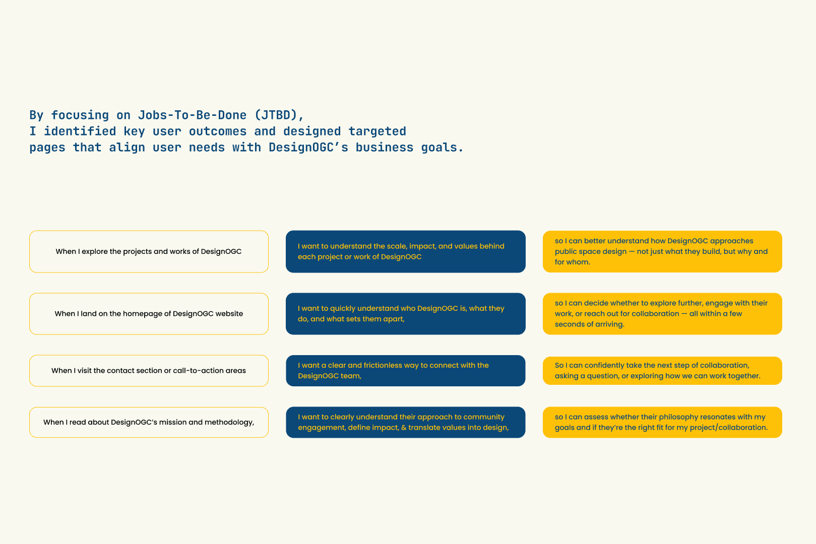
Implementing Research-Led Strategy
KEY CHALLENGES | KEY INSIGHTS |
Low Engagement The website doesn't compel visitors to engage deeply with the content. | Clarity Converts It should be clear what DesignOGC does, why it matters, and how it's different with a clean, intuitive layout with clear messaging. |
Confusing Layout Key information was hard to find, leading to a poor user experience. | Process builds trust Showcasing not just finished projects, but the collaborative process and impact behind them builds credibility and relevance. |
Minimal Conversion Focus The website lacked clear CTAs to guide visitors towards further engagement. | Purposeful Interaction Drives Enagement Calls-to-action should be relevant and frictionless, guiding visitors toward meaningful next steps without confusion or overwhelm. |
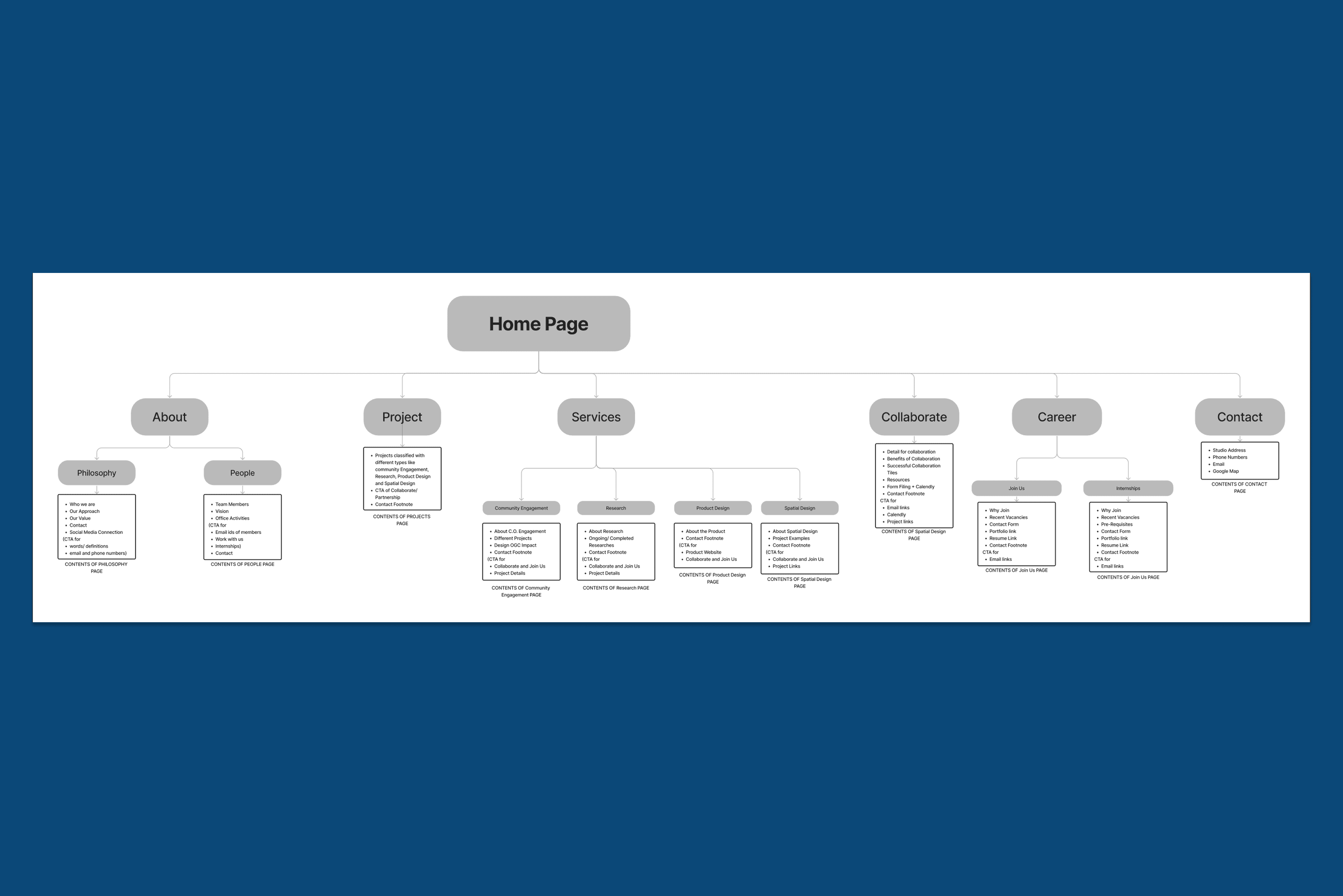
Laying the Foundation with Planning
Post listing all design problems and user research, I moved to the low fidelity wireframe to establish information hierarchy and layout. These were iterated based on feedback to ensure the flow is intuitive and call-to-actions are clear.
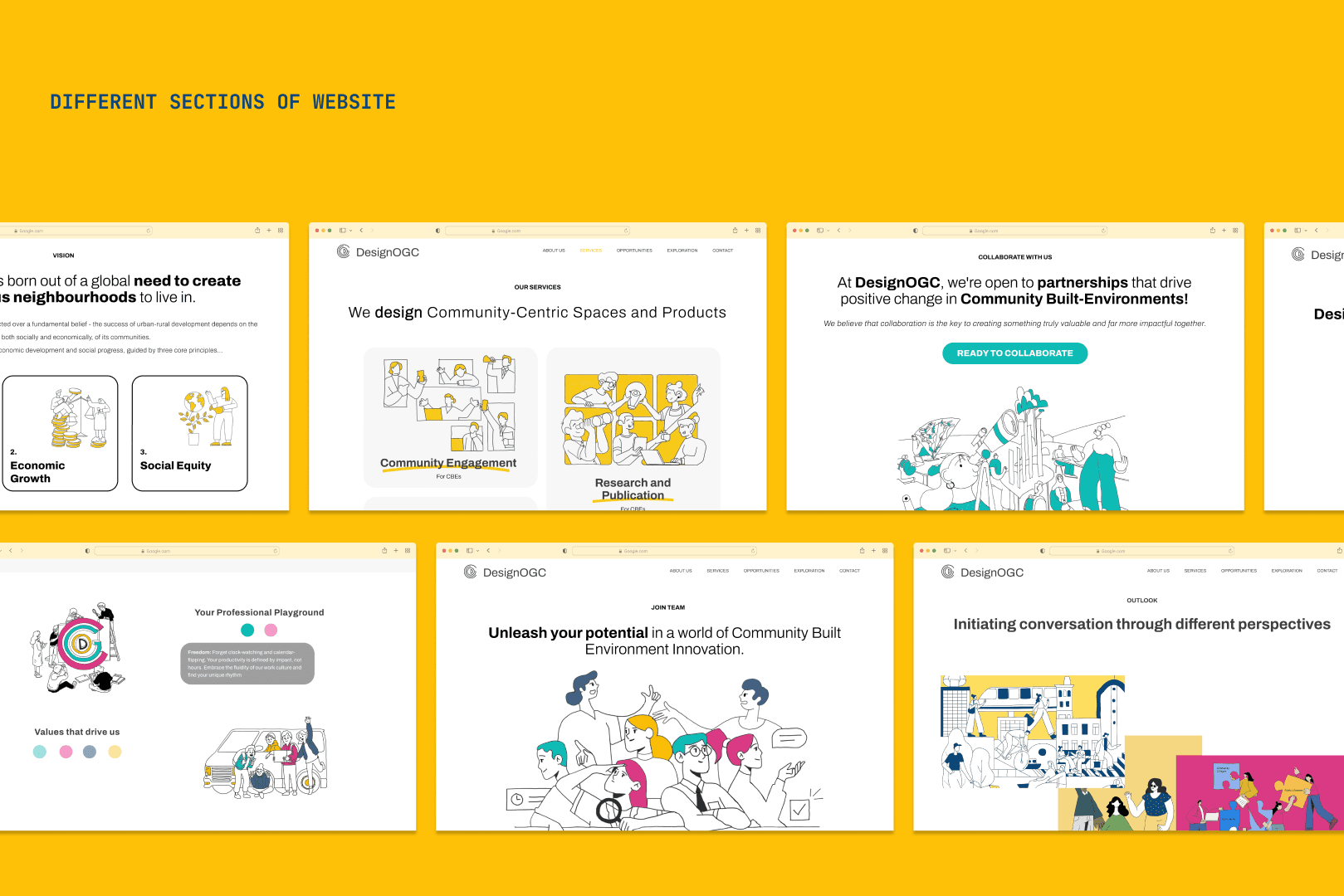
Website Pages that speak intention
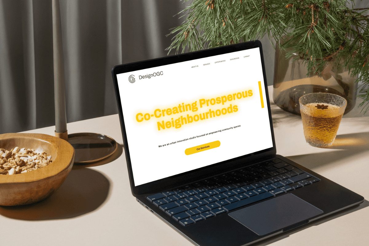
Hero to Action Conversion Funnel : The homepage hero section succinctly communicates who DesignOGC is and what they stand for, immediately engaging users and prompting exploration, effectively passing the 5‑second “grunt test” and reducing bounce rate.
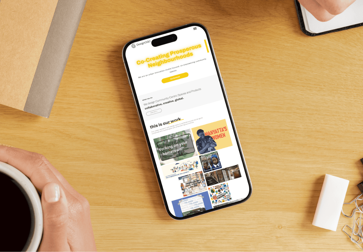
Narrative Rich Project Library: Each case study offers a clear layout that highlights mission, methodology, community inputs, and outcomes, helping professionals evaluate alignment and building trust in DesignOGC’s thoughtful practice.
Values and Philosophy Section: DesignOGC’s philosophy and values are woven into the site structure, not tucked away. It demonstrates equitable, collaborative, global, and empowering practice, making the brand more compelling to clients or partners.
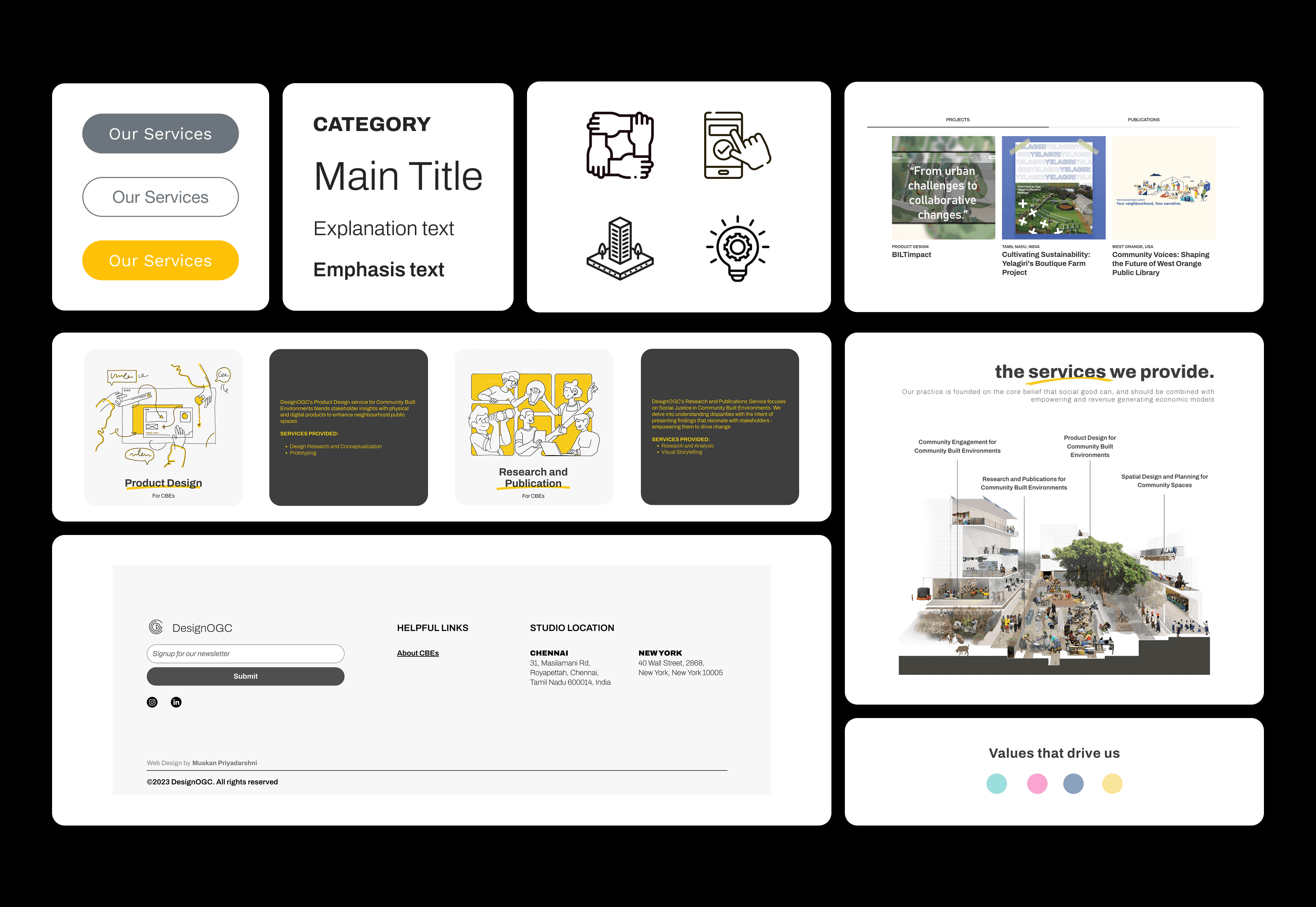
Consistent Visual Identity and Responsiveness: From typography and color to modular graphic elements drawn from the logo, the site maintains strong brand consistency. The design also delivers a clean, fast, mobile-friendly experience which is essential for professional audiences and SEO performance
These features directly address the old site’s flaws; low engagement, confusing layout, and minimal conversion focus and position the redesigned platform to deliver measurable results, credibility, and a stronger digital presence for built environment professionals

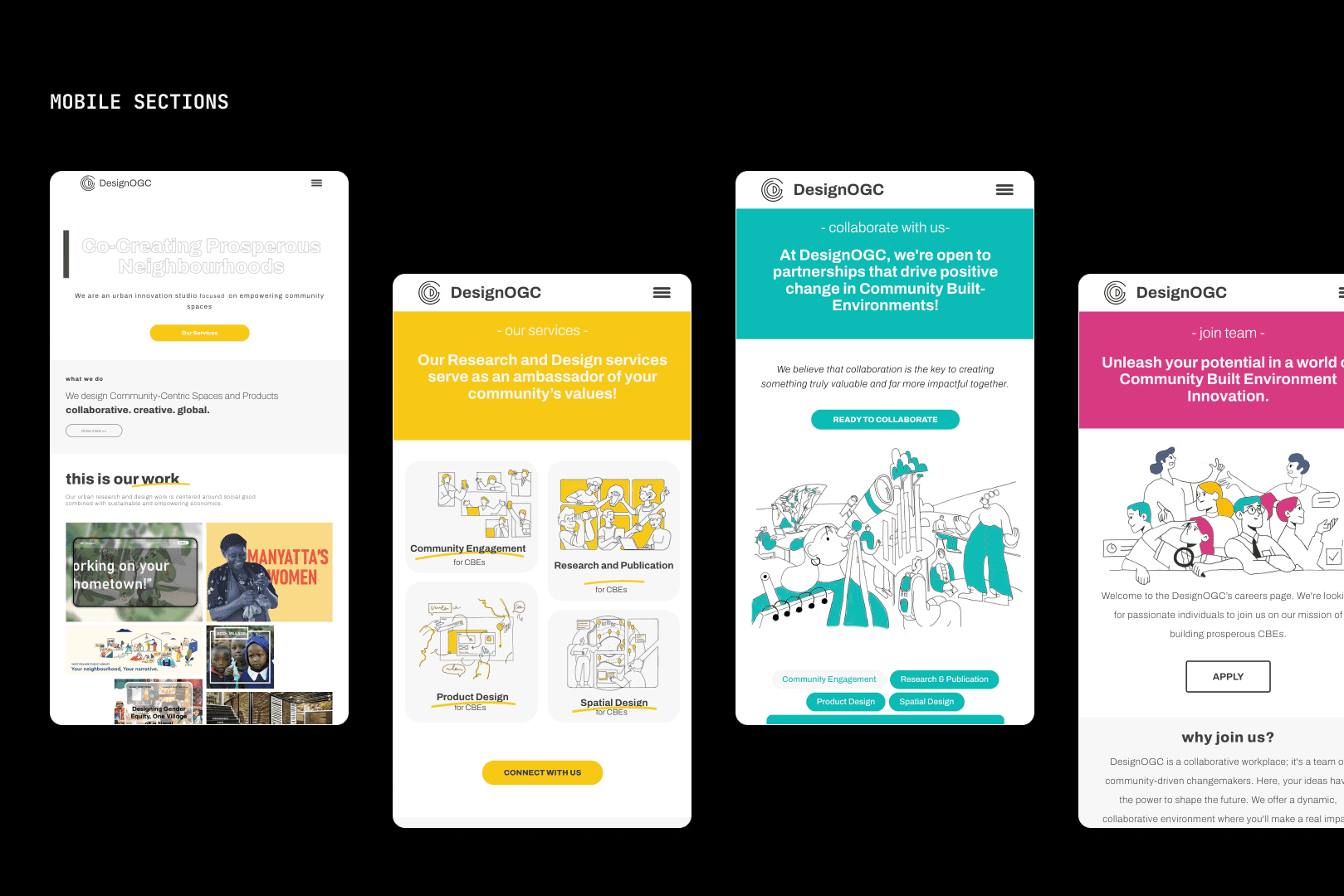
Figma Optimised my Workflow
I designed the entire DesignOGC website on Figma, starting with mapping user journeys and simplifying the site architecture to reflect both clarity and intention. I built a modular design system rooted in the brand’s visual language, crafted high-fidelity layouts that felt human and strategic, and prototyped interactions that brought the experience to life. Every decision made; from typography to CTAs to graphics was about making the platform feel thoughtful, collaborative, and quietly ambitious, just like DesignOGC itself.
What this project achieved?
Improved Clarity & Brand Positioning: The new site clearly communicates what DesignOGC stands for, from spatial innovation to community-driven public spaces which leads to stronger engagement and better alignment with the right audiences.
Increased Inquiries & Collaboration Leads: Clear CTAs, intuitive structure, and trust-building design have led to a noticeable uptick in inquiries from collaborators, clients, and professionals in the built environment space.
Stronger Narrative Around Projects & Process: Each project is now framed not just as output, but as a story that shows impact, intention, and methodology, which in turn helps visitors understand the depth of work DesignOGC does.